Interior Colours 2027 – Which Shades Will Shape the Year Ahead?
Colour is making a strong return to interiors – and all signs suggest that in 2027, it will play a much bigger role than simply being a decorative accent.
Forecasts for the year ahead point to several distinct directions. Alongside bold, saturated shades, we are seeing warm earthy colours, deep reds, muted greens and softer neutrals.
The common thread? Colour is becoming a way to create atmosphere. It can energise a room, make it feel calmer, highlight natural materials or give an interior a more individual character.
So, which colours are worth watching in 2027?
Luminous Blue – Intense Blue Takes Centre Stage
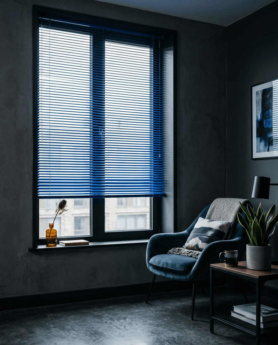
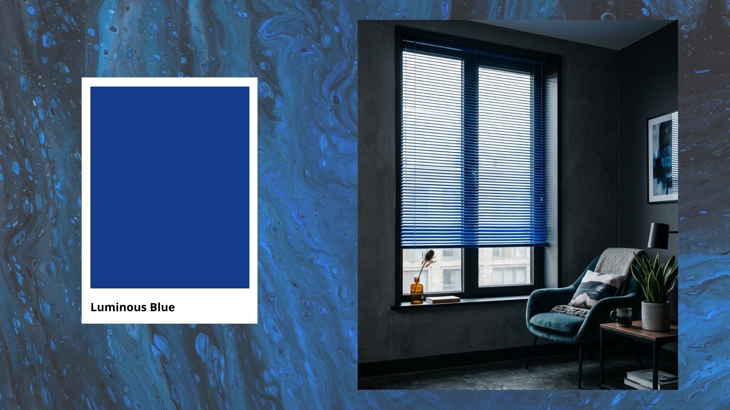
One of the strongest colour directions for 2027 is Luminous Blue – an intense, luminous shade somewhere between cobalt and electric blue.
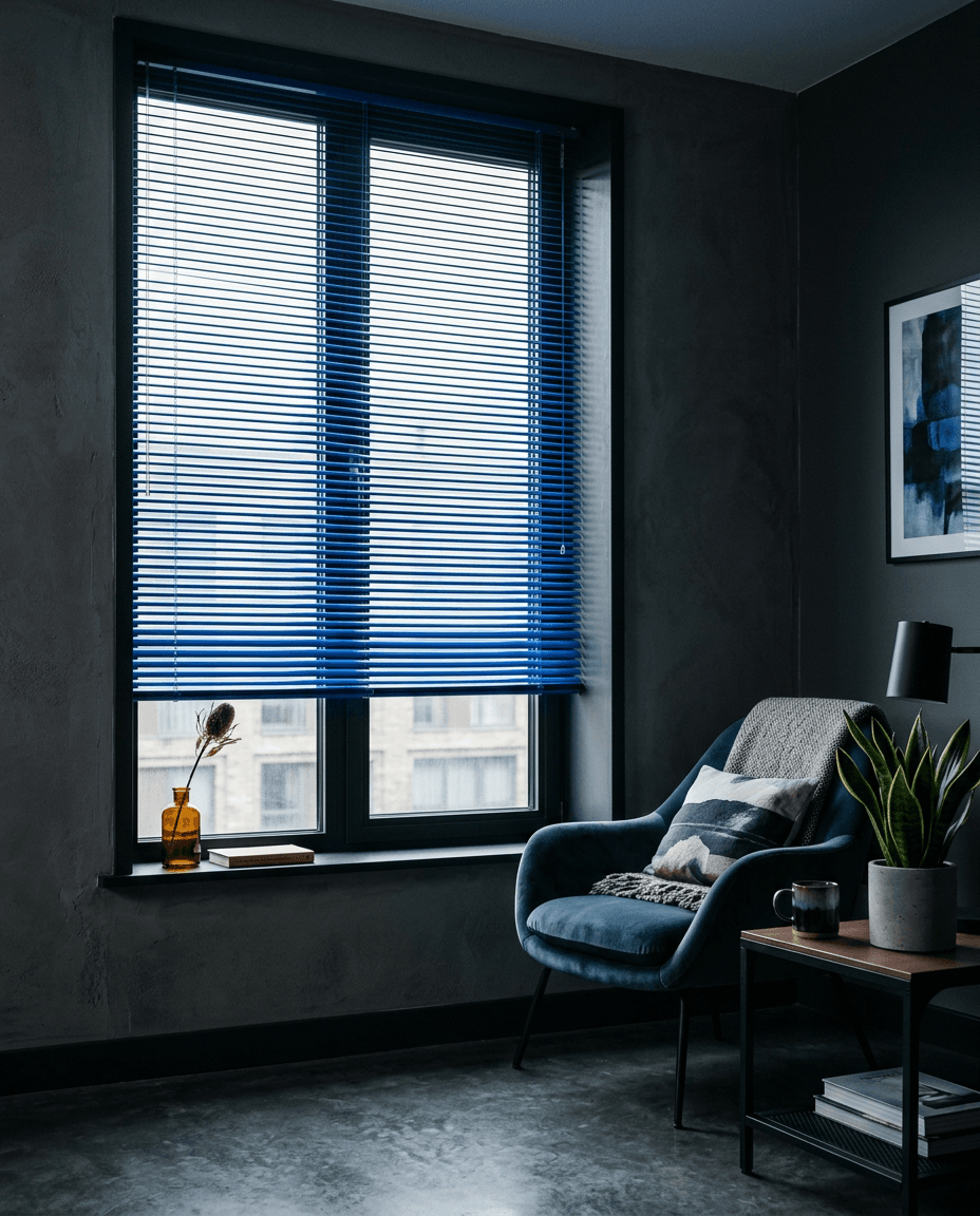
It works particularly well as a bold accent. You do not need to cover an entire room in blue – an armchair, a piece of cabinetry, a pleated blind or another statement element can be enough to draw the eye.
Luminous Blue pairs beautifully with light wood, walnut, warm beige, off-white and natural stone.
Want to bring this bold colour trend to your windows? Aluminium blinds are a great way to introduce a contemporary colour accent while keeping the look clean and minimal.
Burgundy and Oxblood – Deep Reds
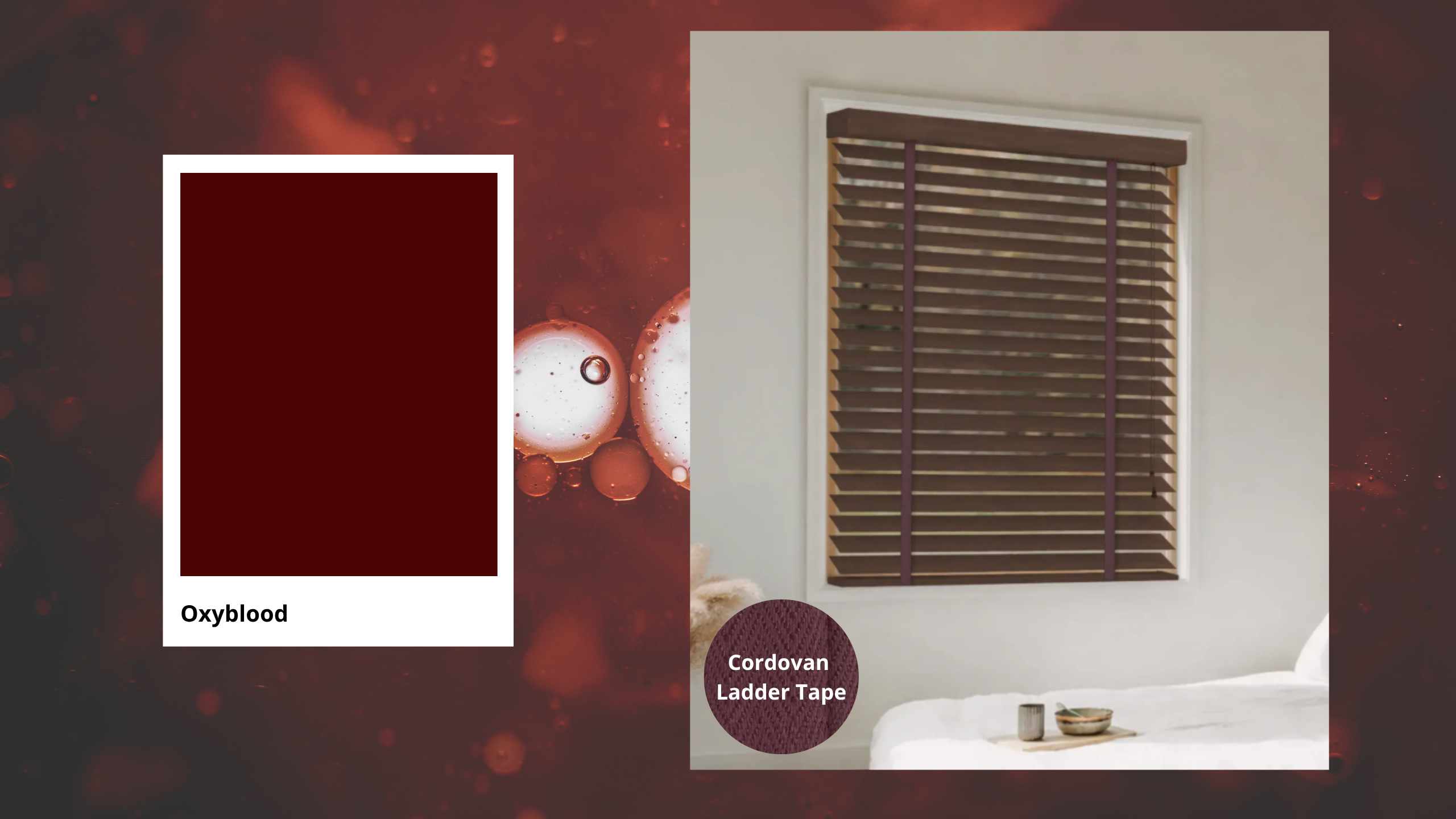
Another colour family to watch in 2027 is burgundy, deep wine red and Oxblood – rich red shades with warm brown undertones.
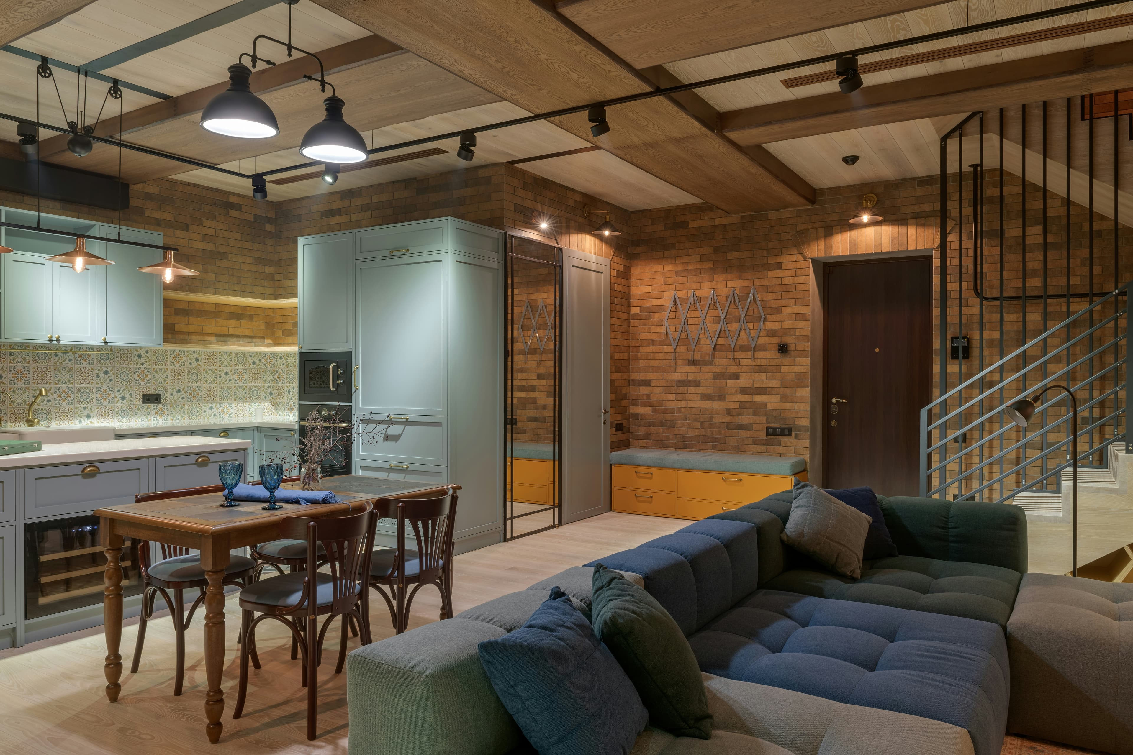
They feel elegant and confident but are much easier to incorporate into an interior than bright, pure red. They work particularly well with dark wood, creamy textiles, stone and metallic details.
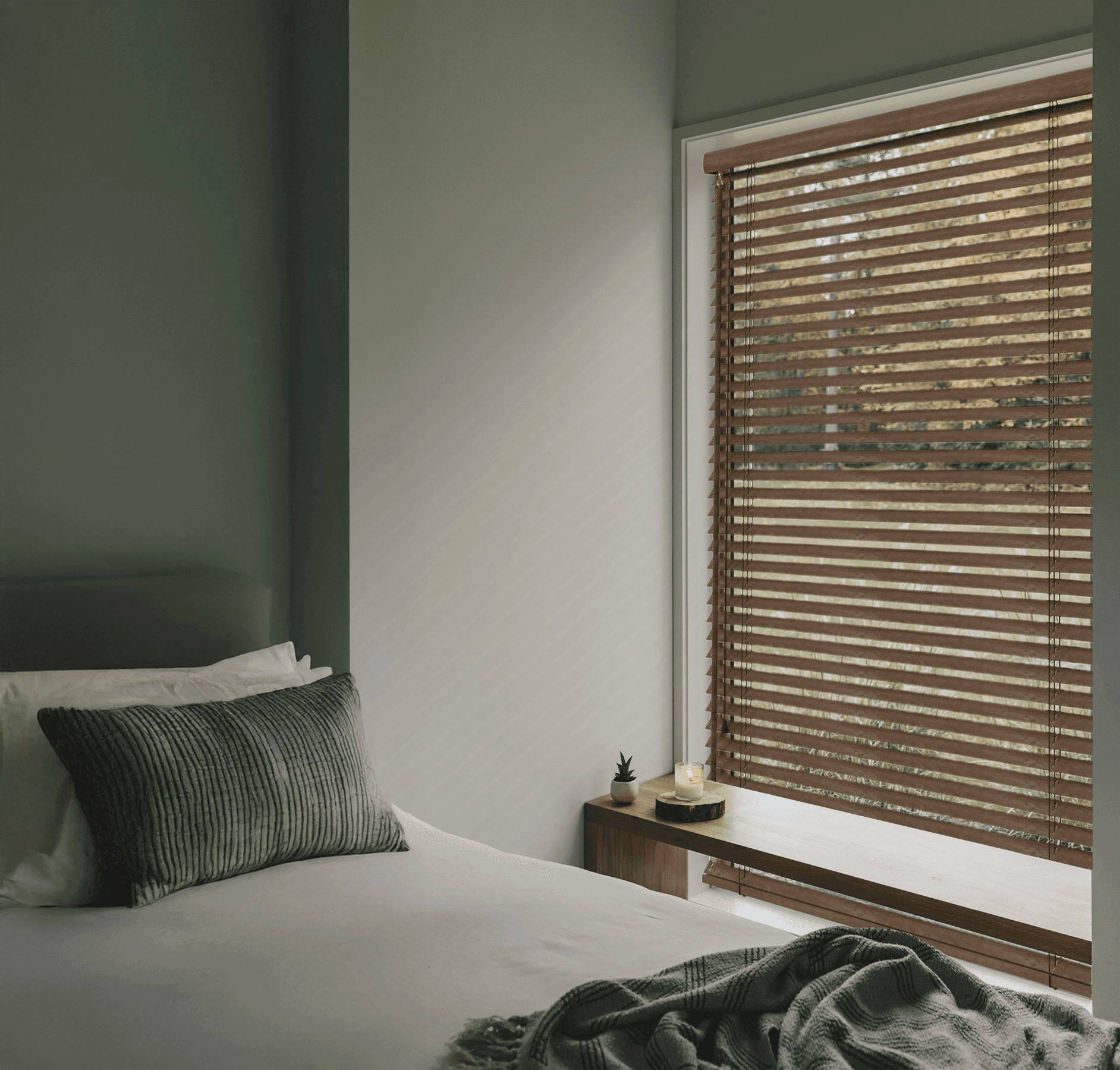
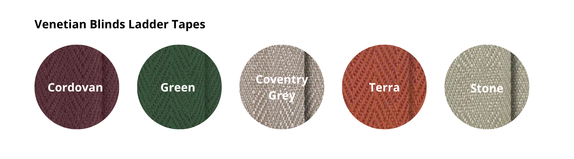
These shades are a great choice when you want to give an interior more depth and a sophisticated character. For an elegant take on this trend, pair deep reds with natural wood and decorative tapes. For an elegant take on this trend, pair deep reds with natural wood and decorative tapes. Choose wooden or bamboo blinds and customise them with tapes in colours that complement your interior.
Ochre and Butter Yellow – Bringing in Warmth
Yellow remains part of the colour conversation, but rather than very bright shades, attention is shifting towards warm ochre and soft Butter Yellow.
Ochre has a more earthy character and works naturally with wood, terracotta and organic materials. Butter Yellow is lighter and more subtle, bringing warmth into a room without dominating the entire interior.
Both are interesting alternatives to the beige tones that have been everywhere in recent years.
Terracotta, Warm Browns and Earthy Tones
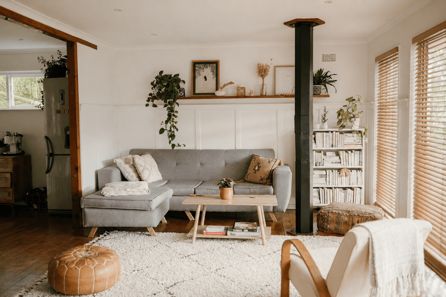
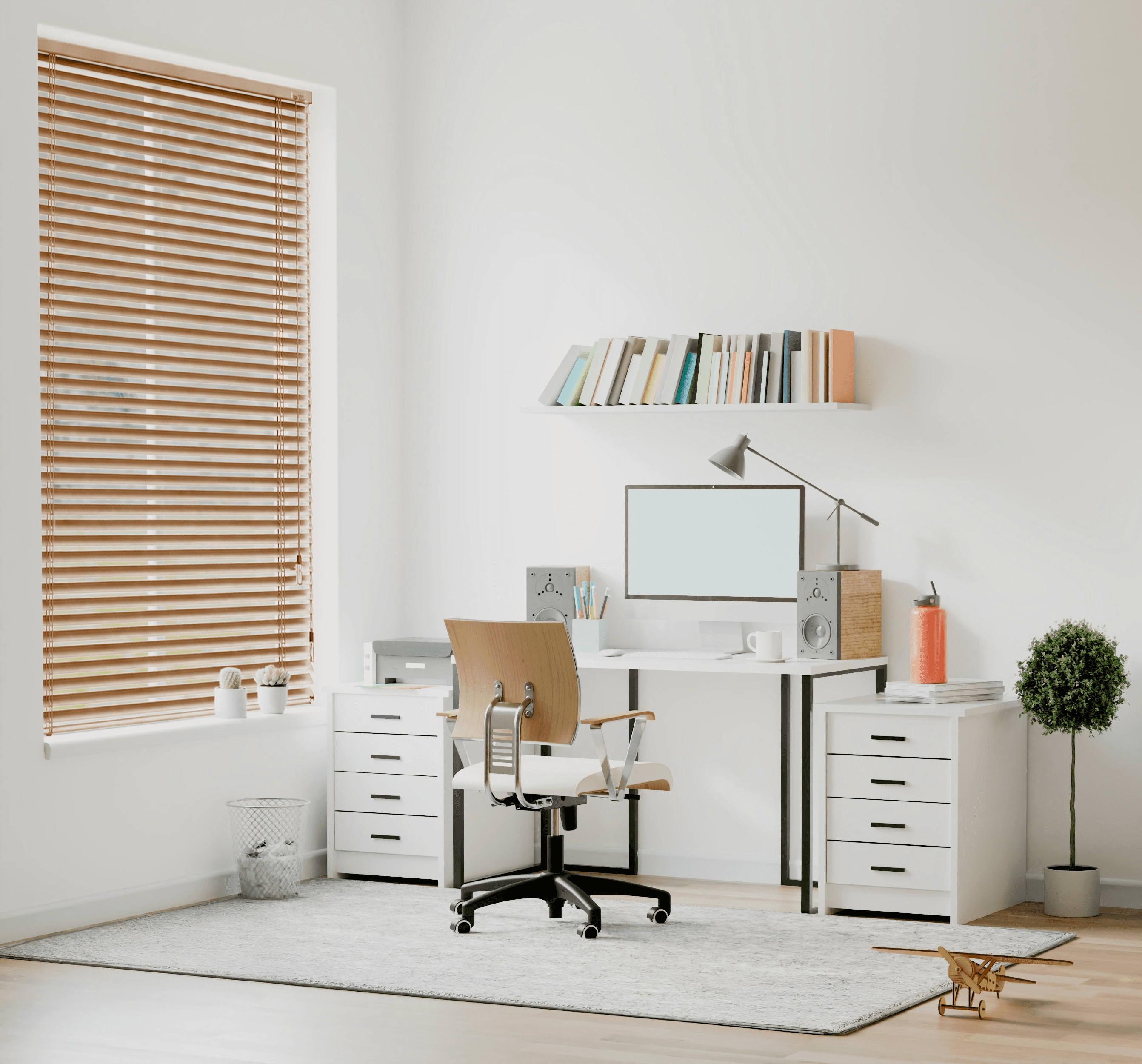
Natural palettes are not going anywhere. Terracotta, clay, caramel, warm brown, sandy beige and muted reds create interiors that feel warmer and more grounded.
Here, colour is closely connected with material. The natural tones of wood or bamboo become part of the colour palette themselves.
That is why wooden and bamboo blinds fit this direction so naturally – they introduce colour, texture and authentic material at the same time. Bring the warmth of natural materials to your windows. Wooden blinds work beautifully with terracotta, beige and other earthy tones, adding natural colour and texture to the room.



Muted Green – Nature in a Calmer Form
Green remains relevant, but it is becoming softer and more understated. Instead of strong, saturated shades, look towards olive, sage and muted greens.
They combine beautifully with wood, beige, off-white and natural textiles, making them easy to introduce into both minimalist and more eclectic interiors.
Neutrals Are Getting Warmer
A neutral palette in 2027 is about much more than white and grey. Off-white, sandy beige, greige, taupe and warm stone-inspired shades are moving to the foreground.
Instead of creating strong contrasts, several similar shades can be layered to create a calm tone-on-tone interior. A wall colour, for example, can be close to the shade of a pleated blind, rug or upholstery.
The result feels calm and cohesive, while different textures prevent the space from becoming monotonous.
Colour + Material + Light
In 2027, colour is becoming increasingly connected with material and texture. The same brown looks completely different on natural wood than it does on fabric, while blue can change its character depending on the surface and the way light falls on it.
That is why it is worth thinking about an interior as a combination of:
colour + material + texture + light.
This approach can also be seen in other trends for the year ahead. If you want to explore the bigger picture, take a look at our Interior Trends 2027 – 5 Directions Worth Knowing guide, where we look more closely at natural materials, textures and the changing way we design our homes.
How to Introduce 2027 Colours into Your Interior
You do not need to repaint your entire home. Colour can be introduced through textiles, furniture, decorative details or window coverings.
With larger windows, the colour of a pleated blind can noticeably influence the character of the entire room. Choose a shade close to the walls for a calm tone-on-tone effect, or use the window as a contrasting colour accent.
Wooden and bamboo blinds naturally introduce warm browns and organic tones, while aluminium works particularly well with more contemporary and minimalist palettes.
Remember that colour changes with light. The same fabric can look different in full sunlight, on an overcast day and in artificial light in the evening.
Tags
Related articles
Discover the top interior design trends for 2027 — from tactile textures to cool metals — and learn how to bring them into your home, window by window.
How to design a stylish living room in 2027? Discover the key trends, colours, materials, lighting ideas and window styling inspiration.
How do you combine wood and metal in interior design? Discover 2027 trends, from wood and chrome to aluminium, plus ideas for stylish window treatments.